
Graphing the Demographic Data
Better represents the coming elder care crisis

I wrote recently about how the Administration on Aging’s annual Profile of Older Americans misses the boat in terms of describing the coming elder care crisis. I included two tables I had created, one showing the gaps in the Profile’s information and the other with the missing data gleaned from U.S. Census Bureau reports.
The problem was that the mass of numbers was difficult to digest. So, I created the following graphs that make the coming trends easier to see. The first shows the relative sizes and patterns of growth of the 65 to 84 and 85 and over populations:
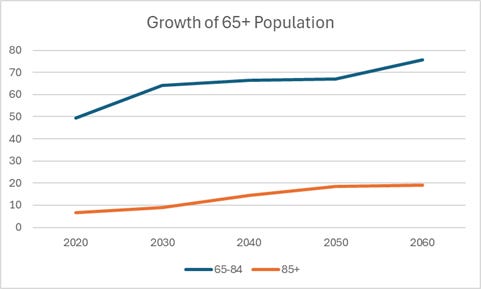
As you can see, the 65 to 84 cohort is growing at a rapid clip during this decade but then pretty much flattens out until 2050, when it takes off again. The 85 and over population’s pattern is almost the opposite. It appears to grow at a slower rate this decade and then will double between 2030 and 2050, at which point it flattens out. (I’ll discuss below why the growth rate for the 85 and over population this decade looks slower than that for the 65 to 84 cohort even when it’s not.)
Looking at rates of growth of each cohort is even more striking:

The blue bar showing the growth rate of the 85 and over population over the next 30 years and especially between 2030 and 2040 that encapsulates the coming elder care crisis, one that the Administration on Aging’s report fails to elucidate. It is projected to grow a whopping 58 percent between 2030 and 2040 and a total of 178 percent between 2020 and 2050. That’s why we’re facing an elder care crisis.
Turning to the reason the 65 to 84 population appears on the first graph to be growing this decade at a faster rate than the 85 and over population when in fact it is not, the explanation demonstrates how the same statistics can be used to make different arguments depending on how they are presented. In this case, the discrepancy has to do both with scale and the focus of the graphs. The first presents absolute numbers and the second rates of growth.
In terms of scale, the top graph uses 10 million intervals. The younger cohort starting at just over 49 million in 2020 is more than seven times larger than the older group which had under seven million members. As a result, a growth rate of 30 percent for the younger group means that almost 15 million baby boomers are passing this threshold this decade. At the same time, a slighly higher growth rate of 36 percent for those 85 and over only produces 2.4 million more of the older old. On a scale using 10-million intervals, the growth of this older group looks much smaller — and it is in terms of absolute numbers, but not in terms of rates of growth. (The ratio of those 65 to 84 to those 85 and over will be cut in half over the next 30 years from seven to one in 2020 to three and a half to one in 2050.)
This is important because our elder care system that is already strained with a relatively small number of older elders will be in crisis as their numbers almost triple over the coming three decades.